ISABELLA FREITAS' PORTFOLIO
Visual Communication Design I Blog
This blog is home to all the assignments and projects for VCDS_201
Professor: Anthony Inciong
Course Taken: Sophomore year, Fall semester 2024
Project 01 . Phase 01 - 09/23/2024
12 Months Project; make simple designs on 2x2 in squares that represent the 12 months in a year. In my group I was assigned July, November and December.
Research: Our group was inspired by the movie poster designer Saul Bass and the way he cut out elements and shapes in a way that was unclean and imperfect. We also found some more material that inspired us within some of the books we found in the library.
Research:
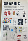
Saul Bass

Graphic
By Steven Heller and Lita Talarico


My Final Month Designs (December, July, November)
For the final Designs I decided to use bright colors and simple shapes to portray the months I was assigned. For July I was inspired by the knew patriotic march of Stars and Stripes Forever composed by John Phillips Sousa, making a simple design using stripes that shine outwards from the bottom left corner, and added stars that art blue and white depending where they line along the red and white stripes. For November I tried to capture the feeling of Thanksgiving and sitting at a table having a meal with someone you are thankful for, showing a symmetrical image of two full plates and a heart in the center. For December I did not want to focus on Christmas since there are so many other Holidays that also share the month of December so I decided to just represent the month as the heart of winter, showing a warm cup of hot cocoa in a red mug, surrounded by snowflakes.
01 Phase 02 In-Progress Imagery, Layouts, Early Digitizations
In these early Designs me and my group each made concept sketches and chose one to digitize into an early concept design for our tabloid. While sharing designs and research we came across some ideas we agreed on. As seen on our designs we see have been mainly focusing on our August design with the two hugging figures and the May watering can. Showcasing the best of each of our designs and and highlighting all of our twelve months. In my sketches I do my best to fill the space while keeping elements of our designs while telling the story and feeling of growing up through the years and how we imagine each month through childhood as we grow up. Using bright colors and simple designs I believe we have accomplished that.
My Months


Tabloid Sketches


Chosen 12 month Designs

Early Digitalization

01 Phase 03 Final Digitizations ideas and concepts - 12 Months Project
In these designs as a group decided on a layout out and each created our own concepts of the same idea, then choose the best one to work off of. We were all very proud of each of our own unique ideas and collaborating together, but the hard part was taking the best parts of all of our ideas to make one final. We highlight the apple from September and the watering can for April to make a composition that looped between the two to represent the constant beginning of the fall where school starts to the end of spring where school ends, looping while all the other months fall along the side. The Months of the school year are disorganized, layered, staked on top of each other almost looking like they are about to fall, while the Summer months are organized, but fall to the very left side since they feel like they are too short and cut off. After the critique we realized that our decided poster was too expected, basic, and unclear on a theme. So we decided to regroup and redo our final poster

Final Design

Kyle

Angie
Aldo
Mehmet

Bella
01 Phase 03 Final Digitizations - 12 Months Project
In this final poster design we wanted to take the critiques we got in class from our previous poster design. We learned our previous design was unclear when it came to a theme, that we didn't have a very interesting visual except for only the watering can, and we didn't have a good use of scale, composition or rythm. So we went back to the drawing board, discussed what we learned, what we needed to change and how we can repurpose the strengths of our design. We have such a great and fun range of colors throughout our months, we all liked the use of layering and playing with the arrangements of the elements within our month designs, and we wanted to really share the concept of growth over time while focusing on the watering can. Once we decided on these concepts we wanted to improve and better portray, Aldo took our ideas and transformed them into this great design that we described and knew we wanted to see. We loved Aldos original more experimental design, but we wanted to strengthen the sense of rhythm, the theme of growth, and have a calendar like structure that can be seen within the design in a tasteful way. Aldo's took all our ideas, recommendations and critiques and hit it out of the ballpark for the group. From the watering can we have a rhythmic experimental layout that carries from the bottom and grows as it reaches the top of the poster in calendar order perfectly sharing our theme of growth over time and keeping our playful fun qualities that make all our designs so charming.
Project 02 phase 01 Research & Mind Map
In my research I tried to create a mind map trying to find the main sources of why me and my group chose to document these images as our research. Using different brands, symbols, and inspiration we can find to fulfill this phase in our project.
Project 02 Thumbnail sketches
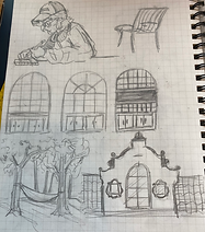
In my first 50 sketches I tried sketching as many different designs as I could based off my research. I tried including Rocky the Redhawk in some of the designs as well as wing element, but those showed to be too obvious and kind of tacky. So I went back to the drawing board and drew my next 10 sketches that I drew and inked I avoided any cliche ideas as much as possible. My best designs were more illustrative icons with details but are minimal enough to scale down and up without losing any of the quality or legibility of the design.
During my walk around campus I noticed that the buildings are identical, but all of the entrance windows are all unique depending on which school it houses.
First Thumbnail Sketches


Inked Second Sketching


Revise and re-imagining final sketches
Final Digitized Designs
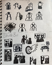
When redesigning my final logos, I took the critiques from my classmates very seriously. There was were issues I wanted to address like the legibility, scalability, and the over all portrayal and emotions that these icons are meant to convey. After taking critiques from my classmates I went out and seeked the opinions of friends and strangers that aren't designers, especially since these icons are meant to be understood by anyone, not just others participating in this project. I took the time to do more sketches and really think about what I was trying to communicate through my designs.
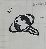
Office of Global Engagement: I chose to represent this department with a key and ring to show how international students come to Montclair to unlock new opportunities, open doors and make themselves at home somewhere new. A key shows that any door can be opened, and usually lead to new or familiar places. The top of the key is shaped like a globe to represent how The Office of Global engagement helps students from all over the world, and the ring around the globe shows the travel and journey from the different places in the world and where people are from.
Sprague Library: For the library I wanted to show all the different resources and materials you can receive at the library, not only books but also physical media like CD's, Records, VHS, and digital resources like access to databases and computers. And how the library is also a place to relax and study and find time to focus with a cup of coffee. So I combined all these elements with a vinyl record, a coffee mug, a row of books, and a computer cursor all to define the type of resource center that the library is.
Academic Advising: For Academic Advising I chose a chess piece with the body as a diploma. I chose a chess piece, specifically the rook because that piece can only move in straight lines forward, backwards, and to the sides. Academic advising reminded me of the same kind of strategy and forward thinking, always thinking multiple steps ahead to beat the game. It also plays a bit into my struggle working with my academic advisor, and that I work more against her then with her in order to graduate.
Shuttle Bus: I had a hard time with the shuttle bus. A lot of my classmates were focusing on things like the route, the destination, or anything not involving the bus directly. Although that solution seems clever, it could really mean any form of transport. When seeking knowledge and ideas outside the classroom, I realized the only way a normal person outside this assignment would ever understand that this icon represented a shuttle bus, it had to directly incorporate the bus. To put my own creative twist on it, I showed a inside and outside view of the bus in my logo.
Center of Writing Excellence: The center of writing excellence is definitely my favorite out of my icons, I was inspired by the stars my teachers used to use to grade my papers, and changed it to also show two people joined together holding a pen which is also part of the star shape. Showing how this department creates excellence in writing by having tutors and collaborators there to assist students whenever needed.

The Re-Process:


Project 03 Phase 02 Research
• Type and Image
• Typography Only
• Staged Photography
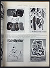
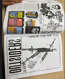
I did a lot of my research on Type, image and typography using the stacks in the library. Looking through the books I took images of examples that inspired me and had me thinking of possible designs for this project, to tell a story within a cover without spoiling the ending and making it visually interesting through type and simple images and maybe a little bit of illustration. My best examples are pages featuring cover art from one of my favorite books, "The Outsiders" along with other book cover designs I thought would be very useful. for the staged photography and dioramas I took a lot of inspiration from train model sets and how people build elaborate tracks, cities, and landscapes all to surround the model trains.


Project 03 Phase 02 Sketches
In my sketches I tried to express as many ideas for solutions as possible. Thinking of ways I can use type and image, how to use only type, and different ways to capture my own images. I wanted to make simple sketches that captured the main point of the story while also capturing the viewer's eye just like how it should when placed on a shelf in a bookstore. I had a very literal take in a lot of my sketches. I've always been a fan of literal covers and images, but a lot of the feedback I got from my peers was against the literalness of my sketches. I continued my project looking back at my research and using the freedom of creation to the best of my ability. As useful as it is, I tried my best to stay out of the world of indesign and step into more of my strengths as an illustrator and get my hands a bit dirty.


Prototype covers


Final covers


Project 03 Phase 03 Final Book Covers
For my final book covers I decided to do all my covers with both text in image. All three feature images that I took myself. To unify them together I made the authors name the same size and font on all three covers, and making sure the authors name is large and eye catching by color matching the text to a part of the image so it would both stand out and fit into the style of the cover. I wanted the style of my covers to match the authors strange stories that have deep messages in metaphoric ways. I wanted them to feel mysterious and meaningful, showing things that represent the story at first glance, but show even more meaning after reading the story.
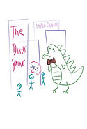
For the Dinosaur I wanted to put my illustration skills to good use, so with pencil I drew the girl and the dinosaur together from the story to show drama and a hint of romance. I Decides to cut out my illustration and rip it up to show the pain the dinosaur is feeling, the rips also obscure the image of the dinosaur just like how the other people in the story don't have a complete picture of what a dinosaur completely is.
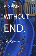
For Games Without End I wanted to emphasise the game they were playing, that it started out fun and honest, but as time passed it became unhonest and messy. So I showed a line of dice that became more distorted and obscured as it goes down for my cover. I accomplished this effect by using one of my sets of dice on top of a scanner and moving it as it scanned. I then I hand made the letters in the title by cutting them out of paper. And the eyeballs in the letters "A" and "O" are meant to portray the two main characters, looking away from each other to show their terrible communication skills and not properly facing each other.
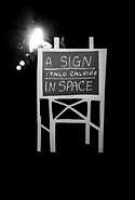
For A Sign in Space I wanted to take a more abstract route. Using an image of my room, printing it out and cutting it up then bring it back together and filling it in photoshop with generative fill. I then added a hand written title, A photo I took of myself running along train tracks, and drawing a silhouette over myself to obscure the fact that it's a real person. The goal was to show how far the character in the story traveled far across space searching for his original sign but ended up lost and running towards nowhere as the space around them becomes even more unfamiliar.
Project 04 phase 01 Research & Mind Map
In my research I created a mind map showing my findings in the three books I collected and looked through to find my answers to the questions, what is graphic design (visual communication)? What constitutes “good” graphic design? And what makes for “professional” visual communication? And during my researched I also seeked inspiration for the kind of design elements that I want to use on my poster. I discovered a lot during my research, like the relation of illustration and photography to graphic design, and how you can design almost anything and use anything to design. I also learned how creative fields can have a lot in common as well as common goals. I learned all this from the books I borrowed as shown in my mind map.
Project 04 phase 02 Sketching
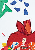
My sketches show some of my thought process through my research phase and some concepts I wanted to do for my poster. I knew I wanted to fill the space like designs from the designer Aaron James Draplin with some of my own hand drawn icons and a early 2000's style. My hand drawn icons show my various interests and parts of my personality. My sketches show a lot of different visual elements and different layout ideas.
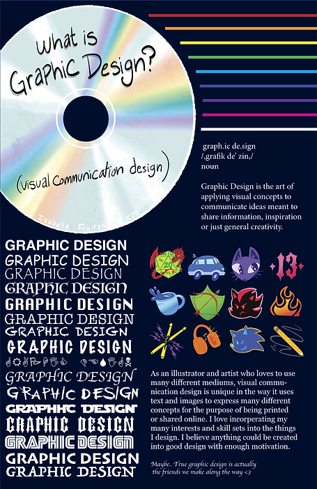


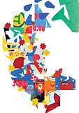
Project 04 phase 03 Final Poster
In my final poster I decided to keep my early 2000's style and making a layout that still occupies all the space on the poster while still keeping the poster appealing to look at. I made my hand drawn CD as the focal point of my poster. I went on to show "GRAPHIC DESIGN" in sixteen different typefaces to add style and variety. For my hand drawn Icons I drew some of my interests like music through a pair of drumsticks and headphones. A coffee cup, pencil, archery crest, and a D20 to represent things I like to do in my leisure time. Sonic and Shadow the Hedgehog from the Sonic franchise because they are my favorite characters. My car and cat since they are important to. And My tattoos which is the number "13" and the flames. And finally I added my personal definitions of graphic design just as the project called for. I was sure to make my definitions personal just like my visual elements. Design is about connecting with people and communication, so through my personal touches, I wanted to connect with those viewing my poster about the person I am and hopefully have them think about what design is to them.