ISABELLA FREITAS' PORTFOLIO
Visual Communication Design Studio II Blog
This blog is home to all the assignments and projects for VCDS_306
Professor: Anthony Inciong
Course Taken: Sophomore year, Spring semester 2025
Process Work and Final Designed Artifacts.
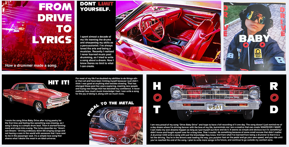
In my research looking for inspiration from my life for this project I decided to make a paper CD and case sharing my life growing up as an artist and a drummer that now likes to write my own songs even though, funny enough, I don't really know anything beyond the drums. It's grown into a project I share with my friends that has connected me to my life growing up in band. My mood board shows photos that share my personality and thoughts reflecting on myself and the projects. Even though I am no longer in a music program and fully focus in art as a career, my connection with music is very important to me. It reminds me of all the things I can do and have done outside of fine arts and design and all the memories I have and want to continue making by sharing music and playing my instruments with my friends and family. The song I wrote is very special to me, it's called "Drive Baby Drive" I don't have any instrumental recordings yet, and I'm not the best singer, but I've fallen in love with the project and am working with friends to hopefully find a way to make it come to life. The song is a simple love song describing the perfect, American dream type fantasy. Just you and someone you love in a pretty car driving without a care in the word, a tank full of gas, no destination, all while singing along to your favorite tunes together. It truly is my perfect dream, and I wanted to use it as an artifact to share my dream and how music has made such an impact in my life.

Finished Artifact
Front and back covers

Process Work: Prototype CD Case


My CD case has a front and back cover showing off both my hand drawn, and digital illustration skills with vibrant portraits show casing me and my drums. Then the inside I have a booklet describing my story as a drummer, artists and aspiring song writer while show casing photographs I took myself on how I imagine the car that's being driven in the song. Then I have the CD in a CD sleeve from my collection. On the CD I made from paper I have the front that looks like a CD with the song title "Drive Baby Drive" and some doodles to mimic how I decorate some of my personally burned CD's in my collection, then when you flip it open like a book, all the lyrics are written for the song. And on the back it explains my plans and hopes of bringing the song to life as a recording one day so I can share it with people instead of just humming it to myself.
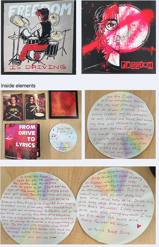
Inside booklet
Ponge Work and Research
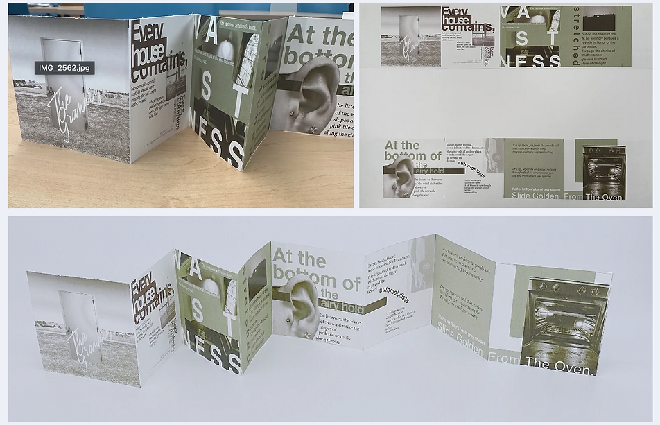
For this project we got Ponge's poem The Granary and we have to make an accordion fold 8 page booklet with front and back covers that goes through the poem and has visual elements that match the story and meaning. Through our research we looked for collage like elements to recreate the sense of nostalgia that the poem describes. As a group we explored the meanings we found in the poem and how to portray them visually. I sketched out a layout and looked at color pallets to use for our projects. Logan did the detailed analysis of the poem and chose some imagery to use in our layout, and as the group leader Daniel has been compiling all of our work together and organizing our layout. It's been a great group effort towards a final product.


Through our research for this projects and our analysis of the poem, we decided our main theme for our design and style will be based off the feeling of nostalgia since that was the main themes we were seeing in the poem. We chose light desaturated earth tones to resemble aged photographs and nature since the poem discusses how all things come from the earth and how time passes all things return to the earth. A lot of the photos in our design layout was taken ourselves. Daniel skillfully edited the picture of the door in the field himself as well. Also through the accordion fold method we wanted to make sure to visually portray the themes of the poem as well and making it interesting and compelling to read and look through, emphasizing important words and lines to portray these themes to the viewer. I believe our final result captured all these aspects, beautifully capturing Ponge's poem.

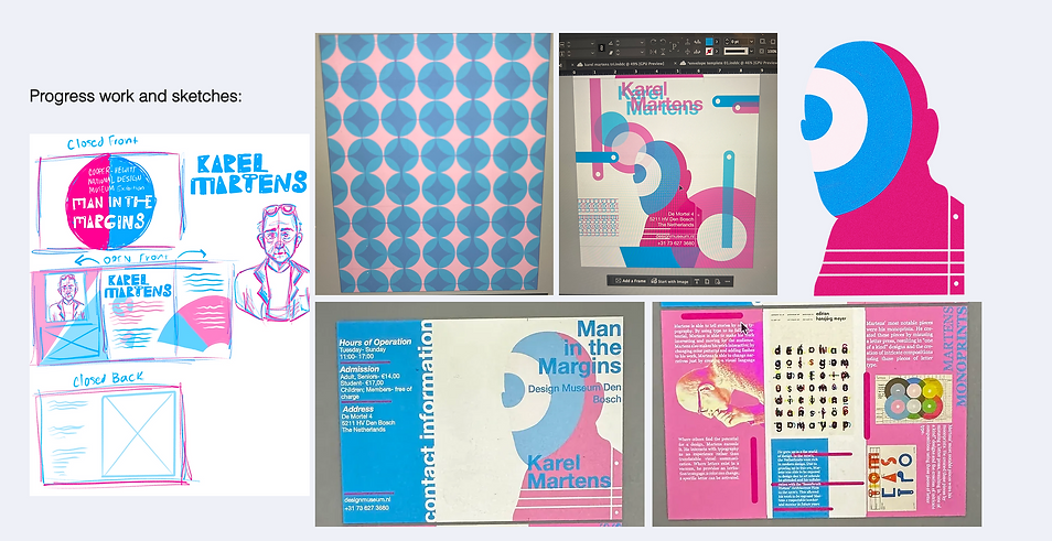
Spotlight: Karel Martens
For this project me and my group with Daniel and Logan had to create a pamphlet for an exhibit for a specific graphic designer. We chose to highlight Karel Martens' work and talk about his life and impact as a designer and what he is doing today. Our Exhibit is titled Man In The Margins after a quote of his when he describes himself as the man in the margins when he talks about himself as a designer and professor. We chose to have our exhibit at a museum in the Netherlands called Den Bosch Museum of Design since Karel Martens is from the Netherlands. We chose the two colors magenta and blue to show off his mono printing technique. We took a lot of inspiration from his style and work to replicate in on the invitation and envelope. For the research we mainly looked at his work as well as other invitations and pamphlets for exhibits hosted by museums.


Research and Inspiration:

Research links and resources:
https://designmuseum.nl/en/plan-your-visit/
https://www.pentagram.com/work/pentagram-x-karel-martens/story
https://www.artsy.net/artist/karel-martens
Martens, K., & Ojeda, D. (2019). Karel Martens: Printing Wor[l]ds. Journal of Modern Craft, 12(2), 147–160. https://doi.org/10.1080/17496772.2019.1620433
Final work:
While working through this project me, Logan and Daniel really had to find the perfect balance between distributing work for our projects as a group. I'd say this project was the one where we really had the perfect balance. Logan worked a lot on the research, fining articles and putting the slide show together, Daniel did the sorting through Logan's research to find exactly what to add to our pamphlet, as well as laying out the inside of the pamphlet. And I did a lot of the visual research as well as choosing which of Karel Martens designs to pull inspiration from and display in our layout, as well as making the envelope and putting the physical pamphlet together when we were testing and printing in the lab. Karels work is truly inspiring especially his one of a kind pieces like his monoprints and his choices of color and materials. I was particularly proud of the pattern I designed for the interior of the envelope that was inspired by one of his pieces. It's a small detail but Karel Martens always cared about the minor details and we wanted to have the same kind of thought and care when doing this project.
Finished Invitation and Envelope

Just Add Water: Brief and Research
For this project we had to make a our own unique product that falls under the following categories: Utilitarian Apparel, Heavy Equipment, Agriculture, Transportation, Engineering Design. We also had to imagine this product if it was in the year 2039, a miserable future looking for new innovative ideas to bring fun and hope back to people of the time. I chose to do transportation for my product category. I chose transportation since It's truly something all people need for their day to day lives, all people need to travel. During my research I couldn't decide what the scale of my product would have, like a very large effect on the totality of how we perceive transportation, or a fun product for individual use. I decided to make a product meant for individual use in order to be more creative with the package design and imagine it more as a product that would need to stand out on a store shelf. I also researched what kind of transportation I wanted to create or improve, and I decided to choose the world of surfing and skate boarding. I was inspired by surf board wax too make a new board wax that when it makes contact to water it'll grow a new surface that allows the board to float over any surface like it is water.

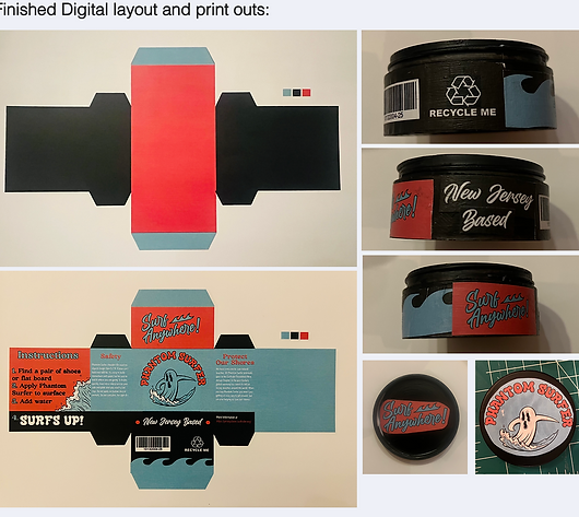
When creating my sketches and prototype packaging I looked a lot at the style of surf board wax packaging. I wanted the same fun "let loose" vibes and bright colors to help it stand out and fit with the style of transportation I'm trying to innovate. I also liked how surfing is related to water and the product is meant to activated and grow when it makes contact with water. I illustrated the ghost surfing logo myself and chose the name "Phantom Surfer" for marketability since it sounds cool, and it explains the product since it allows anyone to surf anywhere.
Fully put together package:
After measuring my prototype box and deciding on the dimensions I designed the packaging in InDesign and illustrator, printed it and put it together. I wanted to make sure it felt like real packaging for a product from a small local business. I made Phantom Surfer New Jersey based, specifically to the Jersey Shore. I believe in 2039 the environment is dying, especially the Oceans and the beaches are struggling against pollution and global warming. So Phantom Surfer provides a way to surf around anywhere without disrupting beach environments, but on the side of the box it also states how the money made from Phantom Surfer will be donated to a real foundation called Surfrider that works to protect beaches across the Nation and have a chapter in NJ. I did as much research as I could to make this product feel as authentic as possible and I'm proud by how it all came together.
